
I participated in Amazon Design x Adobe Creative Jam for college students across the world to help high school students discover design through a tablet app. Many high schoolers are unsure about their path in life, and a great challenge they face when learning about design is a lack of resources to explore potential careers in an interactive manner. Our solution, Depict, addresses this issue in an innovative way that is relatable to all maturity levels within high school students.
We were challenged to design a tablet app to provide a safe way for high school students, ages 13 and up, to #DiscoverDesign. This app should encourage students to find design in their daily lives, understand the impact of good and bad design, inspire students to explore careers in design.
Our solution, Depict, addresses the target users and their needs with three features: educational resources, lessons on types of design, and interactive games. Our prototype solves the problem in an innovative way by combining a dark, yet fun and whimsical, theme to create a welcoming and informational interface.
Due to the time constraints, my partner and I did some brief interviews with high school students to better understand their needs. There were many similarities in their answers that led to a clear ideation and conceptualization of Depict.
Many users mentioned issues like competitiveness within academics and extracurricular activities adding a lot of stress in their daily lives. The pressure to get good grades, maintain social relationships, and stay on track for a successful career weighs heavily on our users. Rather than spend free time discovering their interests and possible careers, students chose to alleviate stress by playing games, socializing with friends and family, and pursuing hobbies.
With a limited selection of classes available at school, users are not exposed to design thinking or careers. Many of them had never heard of design as a job or college major before our interviews, which indicates that high school students lacked awareness of different careers that exist in the real world outside of core subjects.
Based on our target audience, we considered maximizing the gamification aspect of this application to encourage learning in a fun and interactive way. High school students spend a significant amount of time on schoolwork and extra-curriculars, so we created various games to avoid associating design with added stress. We also included badges for completing mini lessons on design.
Design doesn't often come up in Common Core curriculum, so to increase students' awareness of different aspects of design, we wanted to provide short lessons. Design is such a multi-faceted and large interest path, with many different career opportunities, that affect everyone's day-to-day lives. These small lessons should be divided up into different categories of design to allow for students to explore and find their interests, while also gaining a broad understanding of how design is applied.
To truly make this application a gateway for high school students to enter design, we want to make external resources as accessible as possible. Current design trends will interest students in a more creative, engaging way that they can apply to their own hobbies or style. We also want to include college and career information so students that are ready to pursue design know what pathways are available.
Based on user needs and our conceptualization, I began sketching this tablet application that included both education and gamification aspects. This laid the groundwork for our lo-fi and mid-fi wireframes.


To serve as easy navigation within the application, we created a list menu that expanded to a vertical sidebar to preserve the screen space of a tablet application and maximize the utility of various features. The bar is separated into two sections, where the top section displays the three main pages: Learn, Games, Resources, and the bottom section displays History, Saved, and Settings.
A key feature for all applications that focus on exploration or education is a saved or bookmarked section. It is important for users to be able to easily return to information they deem important, so we added bookmark capability across the application. The items saved can be accessed from the vertical navigation sidebar or from the user's profile page.
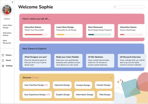
As the landing page, the dashboard is designed to provide users with easy access to relevant features of the application. The top section consists of unfinished lessors or resources that the user may want to return to, without having to go through the search process again. The second section advertises new games that might interest the user, as this application emphasizes the fun that can be found within learning about design. The third section consist of all the different types of designs that are categories on the Learn page, so the user can quickly select a specific subsection of design to explore more.

This game, based off of personality quizzes, presents a set of questions to our user to determine what type of design is best suited for them. While we encourage users to learn about all the aspects within design through the Learn and Resources page, we also want them to be able to prioritize their learning based on their current interests. By including badges at the end, we support the gamification characteristic of the app and personalize the user's experience by explaining what the results mean.
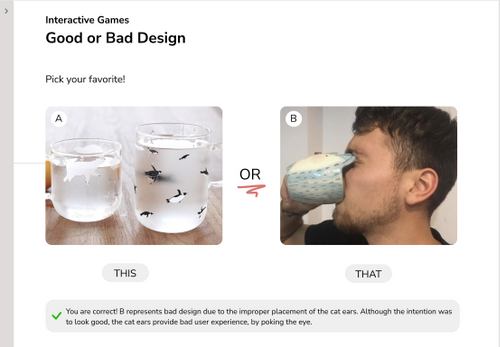
This game presents users with two designs for a similar product, and allows users to analyze and apply their design knowledge to choose the best option. In this way, users will be able to practice design thinking for real-world objects and understand the impact of design in their everyday lives. This game directly addresses two of the sub-requirements in the challenge brief, and we made sure to include an explanation for every answer so users can continue to learn while still having fun. As a casual, but simple, game, users should be able to dedicate just a few minutes of their time every week to expand their design knowledge and take a short break from their stressful lives.

As a social media-heavy demographic, our target audience knows a lot about aesthetics and style. This game encourages users to understand color theory on a deeper level through hands-on interactions. Hopefully, in the future as users work on art or design projects, they can refer back to these color palettes and be able to visualize their growth over time.

The Learn page is broken into categories based on different types of designs by filter buttons across the top. When a category is selected, a few short lessons appear with three subtopics each. We included a visual cue to encourage users to continue learning. These lessons are specific to the category at hand. We wanted to take advantage of the tablet setting so we included an annotation feature on the information pages. Many studies have shown that creative annotation encourages and supports deeper learning, so we wanted to allow users to interact and personally connect with the material.

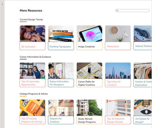
The Resources section aims to bridge the divide between design knowledge and application in the real world. While the rest of Depict teaches design thinking, the Resources section focuses on providing pathways for users to pursue design. This section is broken into three vertical carousals broken into current design trends, career information, and college programs. We were challenged to not only teach users about the different fields within design, but also to provide them with the necessary guidance to enter those fields.


During our review with users, we realized that while we had some fun colors across the pages, our visual design wasn't consistent or focused. Users said that the vertical sidebar in sandstone seemed dull, and the bright colors against white came off more childish than inviting for their age. To ensure that this was an innovative solution, we needed to expand beyond our features and consider our users' needs as a whole. They specifically mentioned not wanting to feel additional stress from an education-heavy application, so we needed to update the application to be more entertaining and unique through visuals with intentional usage of color. Additionally, the excessive white reduced the feeling of a foreground and background, meaning that users were ignoring the titles and search bar to focus on the larger information centered in the page.
As a result, my partner and I decided to create a consistent art direction for our application using dark mode and a few specific colors and patterns. The dark mode enhances all color features and draws the user's eyes to important details. This was especially important to help create a more distinct foreground and background, since the excessive white was too minimalistic and lacked depth. We created expressive graphic content that helped users understand the cohesion within this application while also encouraging continued interaction. Some of these graphics, as can be seen in the new Learn page, are more whimsical and free-flowing, which we hoped would inspire creativity and expression from our users.
We added two launch screens to pique the interest of our target audience and familiarize them with our application brand. The secondary screen describes the main features of the app through timed transitions that give the user plenty of time to understand the purpose of the application. After that, there is a standard registration screen to enter the application.
This improved navigation sidebar includes the three main features, as well as a few important features specific to the user's experience within the application. We wanted to emphasize the features with symbols and specific colors based on color theory to create a stronger brand connection with the user. This can be seen throughout the application, such as the top section of the dashboard.
Since the purpose of this game is to provide a starting point for budding designers to prioritize their learning, we made sure to include explanations at the end to explain their results as advice and recommend further research. We believe that by being reflective, our users will be better able to understand how their passions align with the various types of design. The gamification aspect can also be seen through the badges that are awarded to the user throughout the application.
In the Interactive Games page, we made sure to merge the neumorphic visual design with color branding through the click transitions. The graphic designs describing each game follow our playful brand by using irregular shapes and bright colors. We made sure to provide reasoning to ensure users are applying design thinking.
While most of the page design stayed the same from mid fidelity wireframes, we added our signature pattern to the top right corner to continue the color branding and recommended palettes underneath for inspiration. We also added the missing navigation menu and title at the top.
While we kept the progress circles for users to visualize their growth, we completely changed the layout from grid to stacked and introduced more comical and eccentric graphics following our color theme and some background shapes. The title layout was rearranged to include the menu and bookmark. We switched the textboxes to match the dark background but used neumorphism to differentiate foregrounds and backgrounds. The annotation feature was kept as is to ensure we maximized the functionality of this application for tablets with styluses. At the end, we displayed another reward that adds to the gamification and education support of this application by hosting scholarships for design students to encourage future pursuits.
This page was quite similar to the high fidelity wireframe with a few adjustments to fit our brand. We adjusted the title and added the navigation menu. After switching the background color, we eliminated the colored captions that were using an unnecessary amount of screen space. Instead, we added linear shadows on the article images to overlay the captions and included our graphics at both right corners. Our search feature is also broken down into more specific categories to optimize users' experience.
The Profile page displays the history, saved items, and badges awarded to each user to ensure the most relevant information is accessible. Of course we have the strong brand ties on both the profile and settings page. The badges can be found wherever the user's name is to emphasize our gamification feature.